Hello! I’m back with another update on my still-unnamed RPG Maker MV editor!
Branding
As mentioned earlier, I still haven’t settled on anything! (^^ ;) I really probably should, given I keep referring to it as “the editor” (though it’s not like I refer to my projects by name, given most folks don’t know about them).
I’ve also been thinking about things like color, styling choices, font choices, and how I want to pitch it (this isn’t a commercial project, I just like polishing things).
I’ve come up with a few potential names:
- Crefe - Clean room editor, for everyone.
- Crover/clover/clear
- rMove (reMove?)
I’ve been trying to incorporate phrases like “clean room,” “for everyone,” “open source,” and others into an acronyms. I came up with Crefe as I was writing (pronounced “kreef,” but English is weird, so pronounce it however you like), and I like it.
I’ve been semi-restraining myself from making a website for the project, as I don’t even all that much to show off at this point, and I’m not much of a fan of the vague “teaser” sites that tech companies like to make. If I do end up making something before I finish.
Eventually, once I do decide on branding (…and actually finish the dang thing!), I’m thinking of perhaps commissioning a mascot!
Reactivity
While this isn’t an exciting change, I’ve finally fixed the reactivity issues with the state that resulted in various re-rendering issues! I say “fixed,” but what I really did was implement a subset of Immer’s applyPatches function that runs in place. Ideally, I’d like to completely replace Immer with a slimmed-down version, as it’s quite a bulky and old dependency, and I only need the patching functionality from it.
Changes
Command Styling
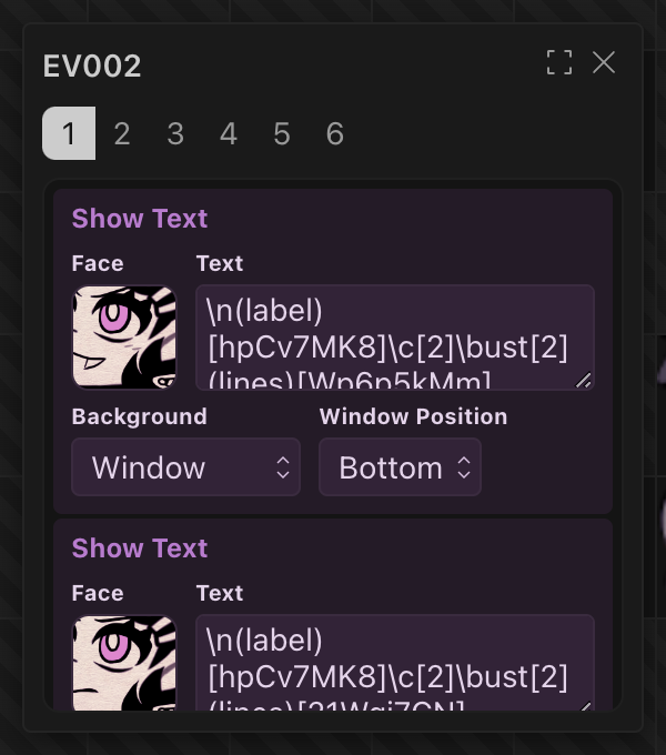
I’ve changed how the commands and popup look. Here is the old look:
And here is the new look:
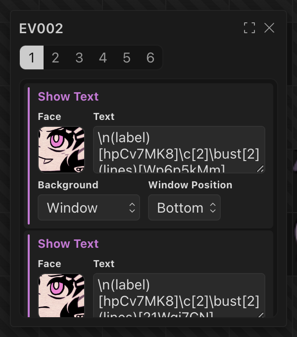
Instead of coloring the entire command, I only accent the title and a little strip of color to the side. The previous designs, where the entire component was colored after the accent, just looked messy and unreadable. Perhaps if I had toned down the color, it might’ve looked better, but I’ve chosen to go with this, as I think it looks more readable at a glance.
I’ve also updated the page selector styles. I’m still not 100% satisfied with the current design, but I think it’s an improvement.
Face Picker
I’ve also finally implemented the face picker for the Show Text command!
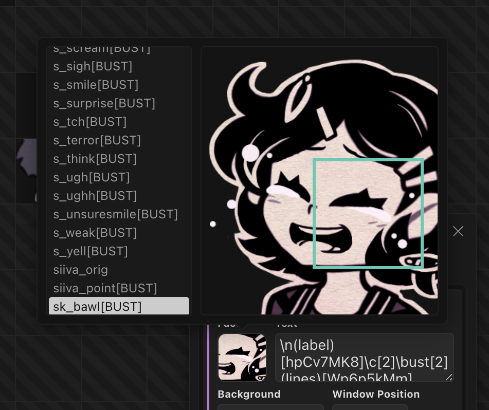
As I’m developing this with The Coffin of Andy and Leyley as my test project, the face selector here isn’t representative of what an actual project would look like, given the game uses a plugin for showing visual novel-style character busts instead of a small face in a window.
Due to a bug with Kobalte’s <Popover> and @solidjs/testing-library, I wasn’t able to write unit tests for the input. Also, I’m not too happy with the face selection ring (the teal box you see in the screenshot), and I’d like to improve that in the future.
I’ll also point to this comment, as to not repeat myself:
// NOTE: This technically isn't parity with the MV editor's behavior. MV allows you to select tiles that are below the first two rows, but this doesn't.
// However, the documentation for the tiles made it sound like only the first two rows would be use, so that's the behavior I've gone with.
Apart from the point highlighted in the comments, the picker should have functional parity with the one in RPG Maker MV. I’ve implemented it in a way that I can reuse it for other similar “image tile” pickers, i.e. for the command for changing actor images later down the road.
Tile Rendering
Oh! And I’ve also implemented the tile image preview things:
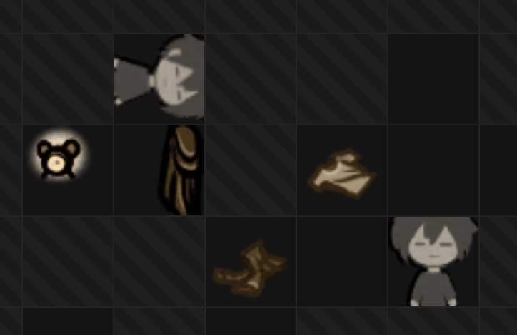
For reference, here’s how that looks in MV:
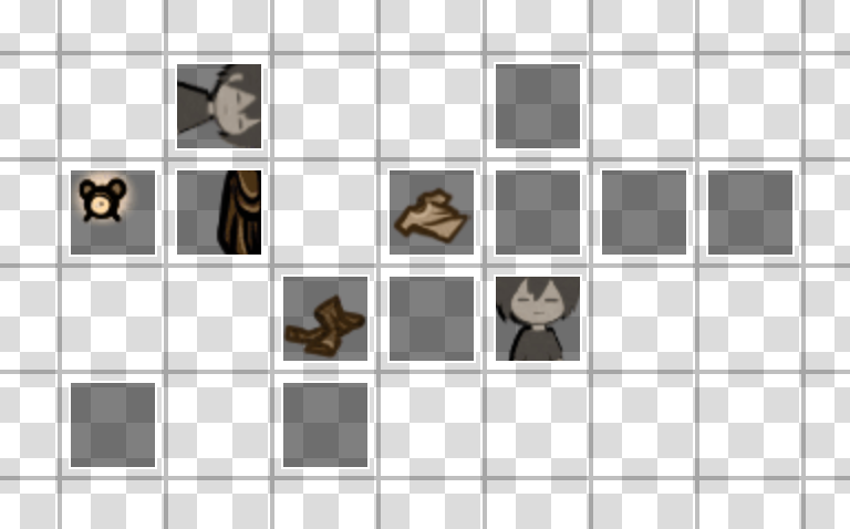
I was considering rendering them differently, as a cut-off doesn’t seem like the most elegant of solutions. After discussing it with some folks, where ideas like overlapping tiles sprites were floated, I decided to do it the same way as MV.
The tile images are cropped through the <canvas> API. As I was writing this, I realized I could’ve potentially used some incantation of CSS background images to achieve the same goal.
Miscellaneous
I also experimented with syntax highlighting for MV’s text format:
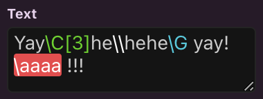
I’ve written a parser for the format and implemented a very basic syntax highlighting solution. However, this isn’t an available feature yet. I’ll likely revisit it sometime in the future and try to implement it with CodeMirror, which would also allow for autocompletion of codes.
This isn’t an exhaustive list of what’s new; to see all of the changes, you can check the commits from last post to now.
I’d like to close this off with some pondering I did today.
There are a few operations on commands I want to support:
- Adding new commands - I think I’m going to show a “add new command” thing when you hover near the area between the edges of commands.
- Deleting commands - Not entirely certain about this one, but I’d like to support both:
- Delete selected commands when backspace/delete is pressed.
- Include a “delete” option in a right click context menu.
- Dragging commands - Make the left color indicator thing function as a drag handle option.
- Selecting multiple commands - In addition to being a drag handle, I’m thinking of also having it be used as the selector (you click to select and deselect). Though that adds a few more questions:
- How do I make this accessible for people navigating exclusively through the keyboard?
- How do I signify that a command (or multiple) are selected?
- How does the user cancel the selection? Pressing escape closes the dialogue, so should deselecting things take precedence? Or should I show a “you have x commands selected”-style component with a “Clear” button?
These are the individual problems. They contribute to the big questions of “how do I make this as user-friendly as possible?” and “how do I make developers efficient?”
Perhaps I should go back to the drawing board on the interface and user flow? Tools like Figma show a bar to the side, whereas I have a popup. My approach might be good for things like map apps, but perhaps not the best for an editor. I’m a Figma user myself, so I’m hoping to achieve a similar fluidity and ease of use.
I’ve built the commands with heavy use of components, so migrating to a different layout shouldn’t be that big of an undertaking. For example, here’s the Show Text component:
export default function ShowTextCommand(props: { command: NestedImmer<MVShowTextCommand>; }) {
    const command = () => props.command[0]();
    const nestedCommand = () => props.command[2];

    return (
        <Command command={command()} label='Show Text'>
            <div class={util.h8}>
                <FaceInput
                    label='Face'
                    prop={nestedCommand()(cmd => cmd.face)}
                />
                <MultilineTextInput
                    label='Text'
                    prop={nestedCommand()(cmd => cmd.text)}
                />
            </div>

            <div class={util.h8}>
                <EnumInput
                    label='Background'
                    prop={nestedCommand()(cmd => cmd.win.background)}
                    enum={ShowTextBackground}
                    localization={labelBackground}
                />
                <EnumInput
                    label='Window Position'
                    prop={nestedCommand()(cmd => cmd.win.position)}
                    enum={ShowTextWindowPosition}
                    localization={labelPosition}
                />
            </div>
        </Command>
    );
}
Any advice on UI/UX patterns I could choose is welcome!